Design history
How tuck boxes became tiny posters
Published
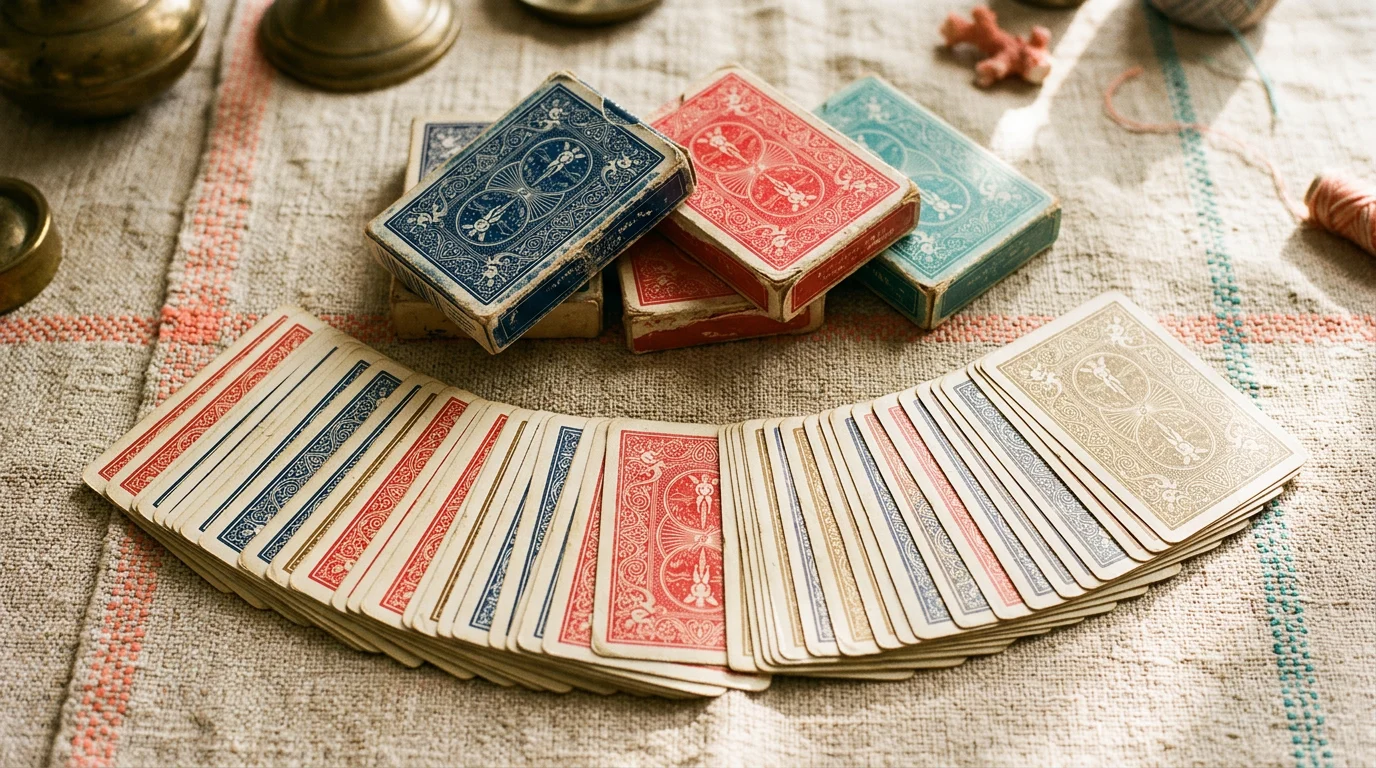
Before television owned living rooms, the tuck box was the trailer for a deck of cards. Printers treated the rectangle like a civic billboard, squeezing railway scenes, tea advertisements, and patriotic medals into the same space now occupied by minimalist logos. Colour was expensive, so designers used overlapping spot inks to fake depth, letting the paper grain show through skies on purpose.
Travel imagery dominated because cards rode in coat pockets through ships and coaches. A palm tree silhouette promised exotic courts even when the courts themselves stayed European. Typography grew taller and thinner so bilingual warnings could hide along the side seams without breaking registration.
When foil stamping arrived, the first adopters still composed like letterpress artists. They mapped highlight ridges so dragons looked embossed even before you lifted the flap. Today’s boutique decks borrow that discipline, only now the tuck must read on a five-centimetre phone thumbnail. Our museum lane preserves the awkward, chatty boxes because they prove marketing used to whisper stories instead of only shouting price.